How do you do a refresh for a major website to increase ad revenues, create a cutting edge experience, while using 10 year old IAB rules?
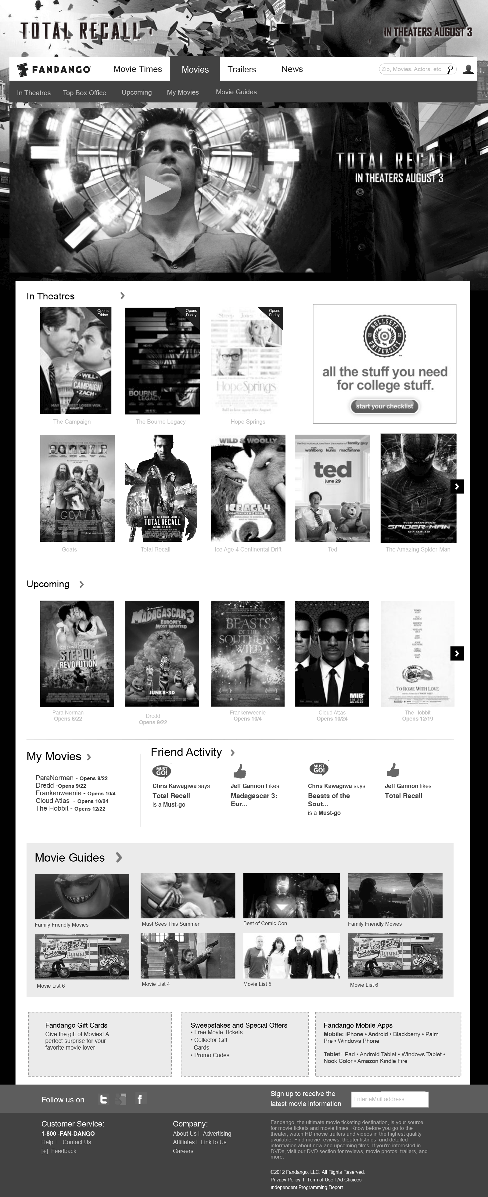
Fandango needed a refresh to the current website. The goals were improving the user experience, increase revenue opportunities for ads, and at the same time creating new flexible ad products. The client also desired a cutting edge app like responsive design, which is modern and fresh, and minimized visual clutter.
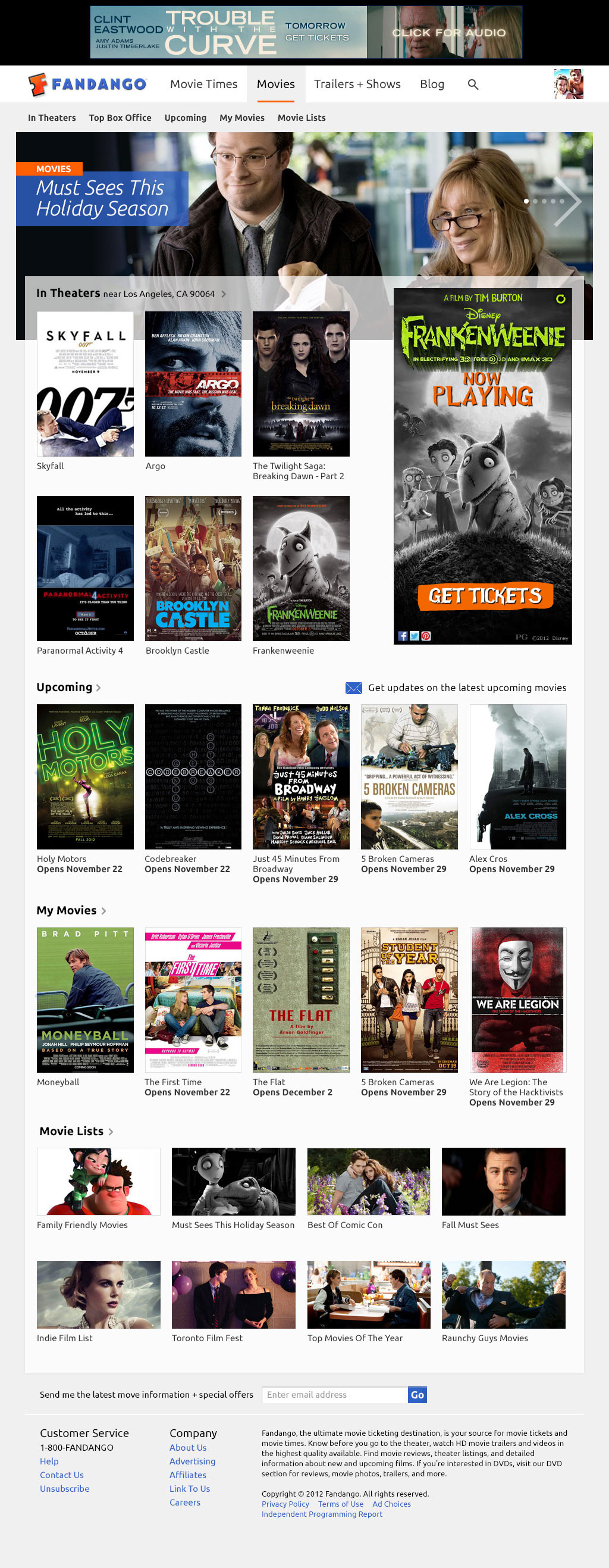
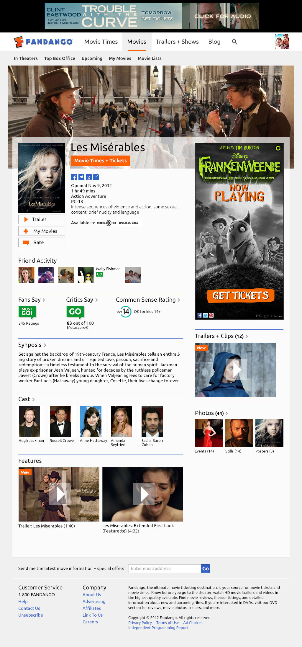
Mobile and tablet traffic represented a large amount of traffic, and were increasing, They also represented the largest opportunity for advertising. Traditional internet advertising kept 2 ads above the fold, so there was also the need for flexible ad units to handle both mobile and tablet traffic.
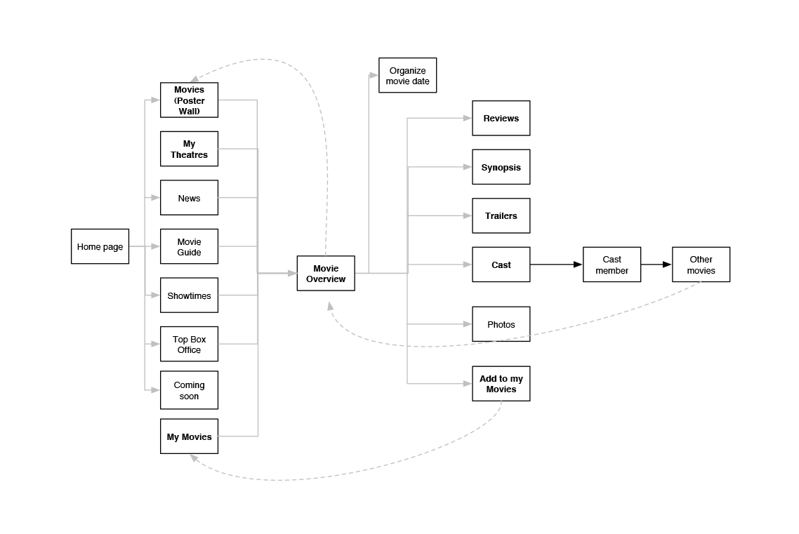
There was another need to fix some usability issues: the social aspects of the site, and improve the listings pages needed to meet user goals and be easier to use. Users had needs like comparing locations, inviting friends, and making a more engaging experience that helped solve these needs was key.
DISCOVERY:
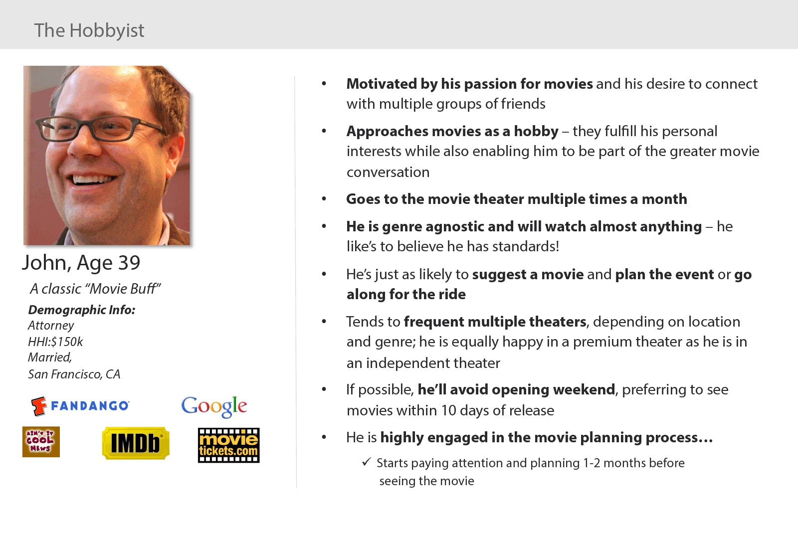
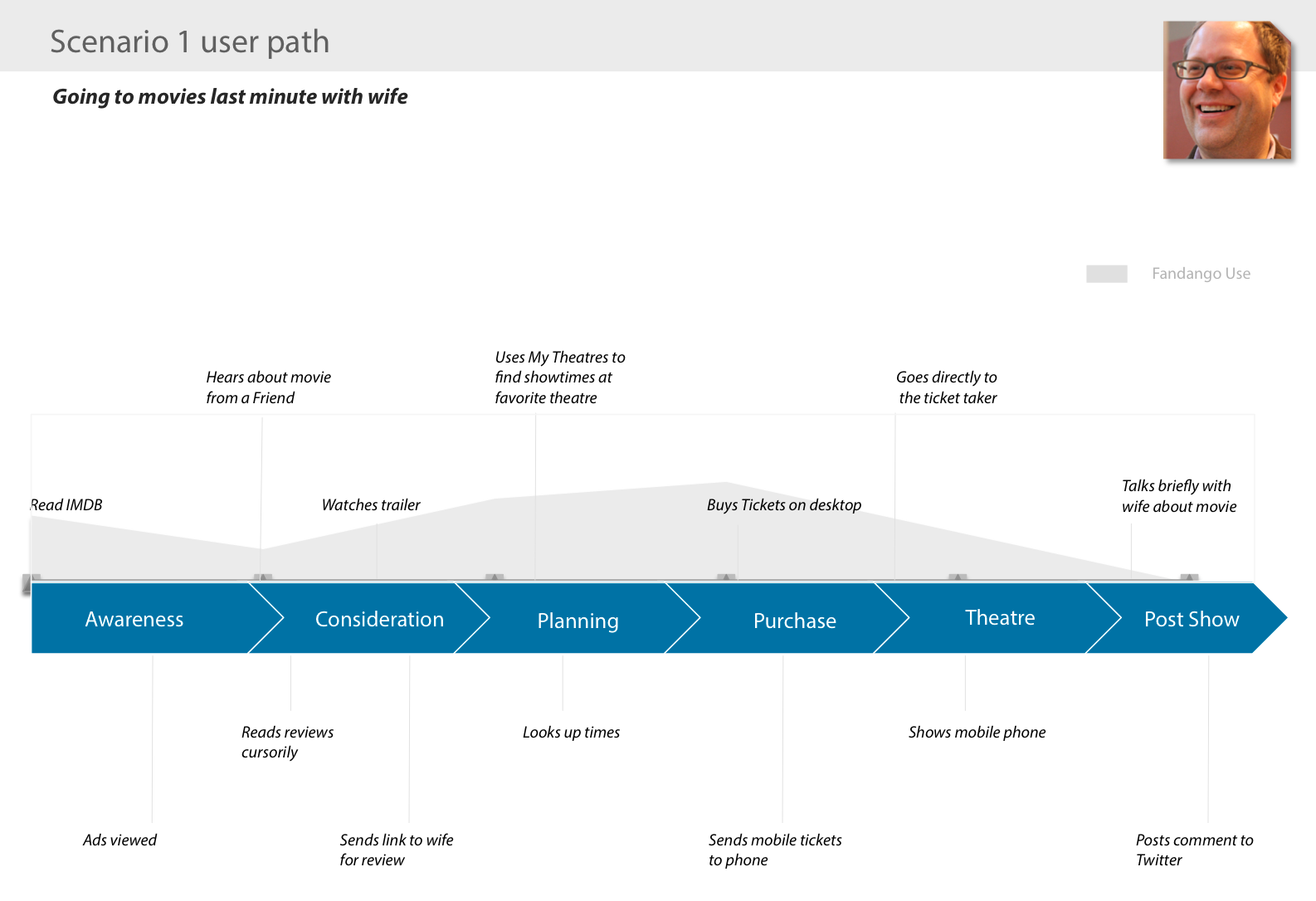
The first step in the process, was to document current user paths, and flows to optimize the experience and refine path to purchase. In addition, we conducted a thorough benchmark study, which included Business Intelligence, Analytics, Product, Ad Sales, Heuristic Reviews, Usability Tests, and Customer Service inquiry. The delivered report gave a 360° view of the opportunities for the product team, as well as a “State of the Union” of the product. Fandango President/CEO Paul Yanover said, “it was incredibly helpful to getting me quickly up to speed.“
IDEATION:
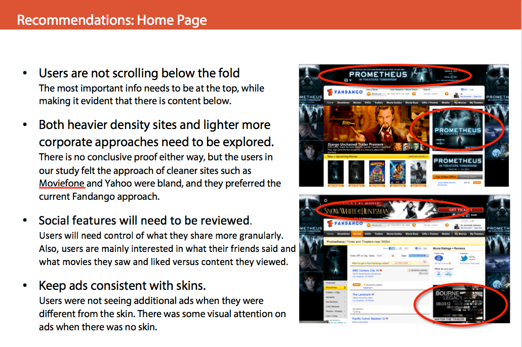
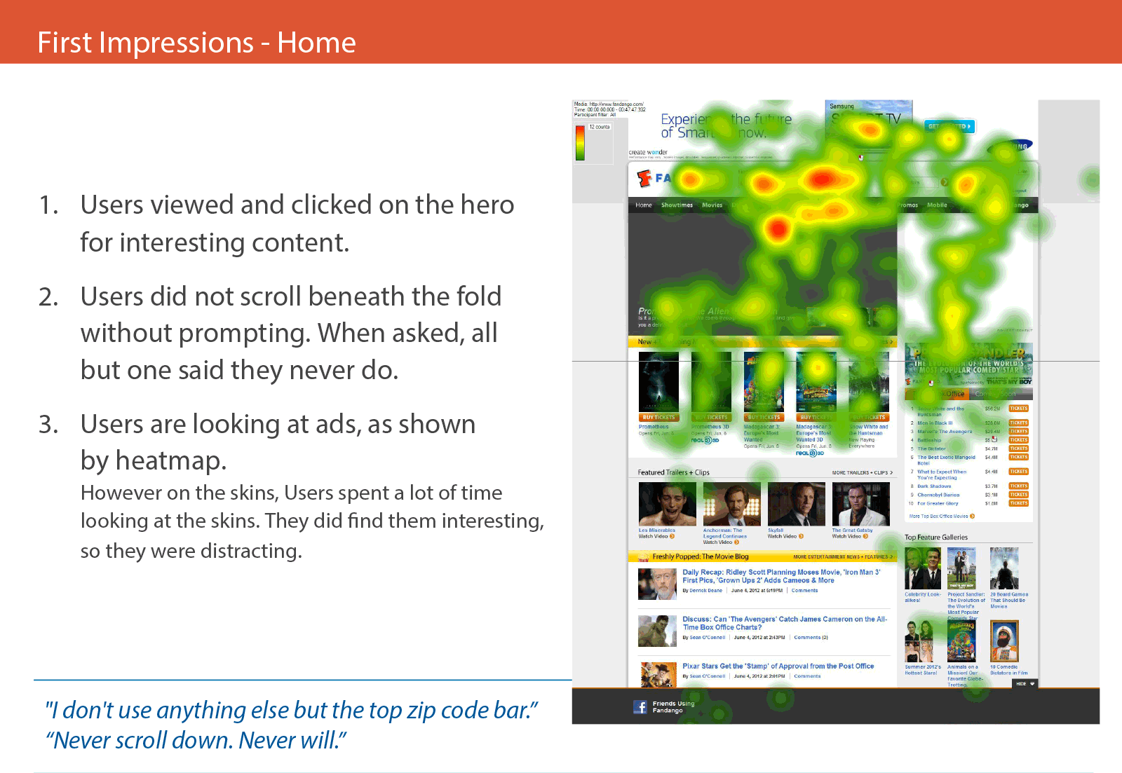
The benchmark study revealed usability issues in commerce, movie discovery and ad effectiveness. We set out to refresh the experience giving users alternate ways to view movie times, surface social content, as well as create new ad opportunities in a way that enhanced the user experience.
We also worked on graceful degradation as screen size decreased, which included multiple variables - takeover, skin, variable sized ad units, etc.
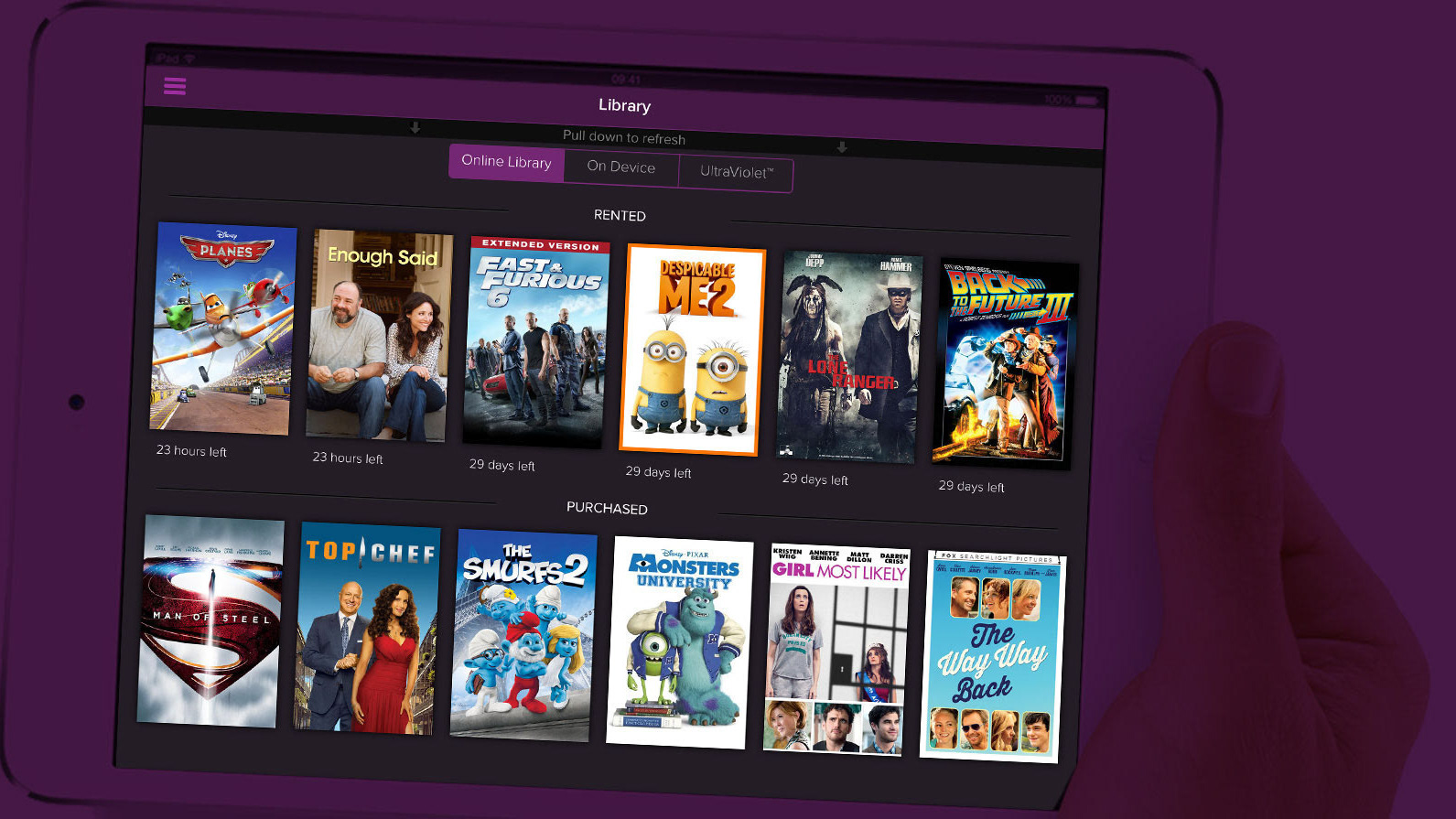
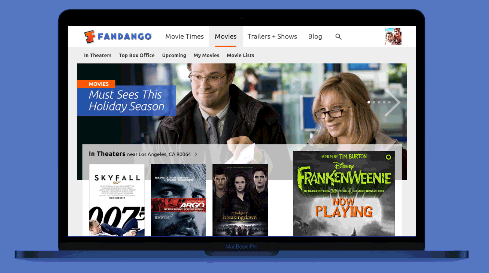
Early ideation with tablet style interactions
PRODUCTION:
In doing our ad explorations, we had several different configurations—a mix of Takeovers, Run of Site, and Advertorial. Plus there were different permutations and
sizes to explore. Ultimately, we created several new big impact ad opportunities,
putting definition to messaging areas for skinning across devices.
sizes to explore. Ultimately, we created several new big impact ad opportunities,
putting definition to messaging areas for skinning across devices.
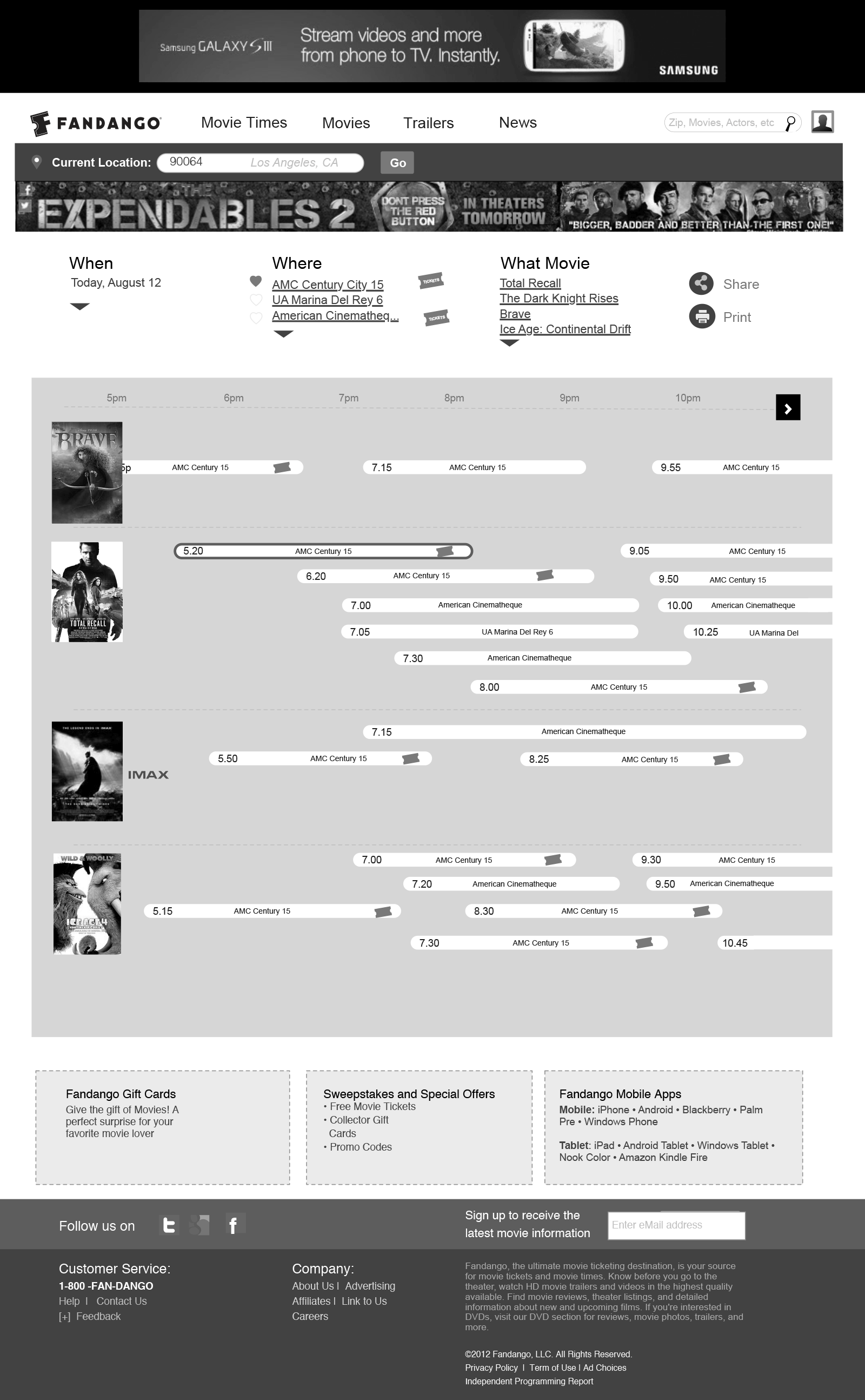
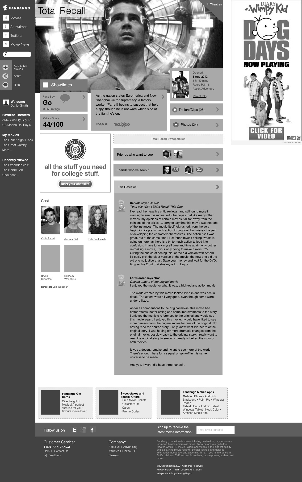
New advertorial opportunities—like this gantt chart style times visualization— helped replace the Run-Of-Site ads, which improved the experience.
SOLUTION:
The final solution was responsive to 768px. We kept requirements to have flexible ad units in top and mid rec spots, while we added 8 new high value ad opportunities, 3 of which were full impact takeovers, which are highly desired by advertisers